Discover why balance is important in graphic design, and how to apply the 4 types of balance to your projects.
Balance is one of the key principles of graphic design. It’s the way visual elements are arranged on a layout and provides stability for the image.
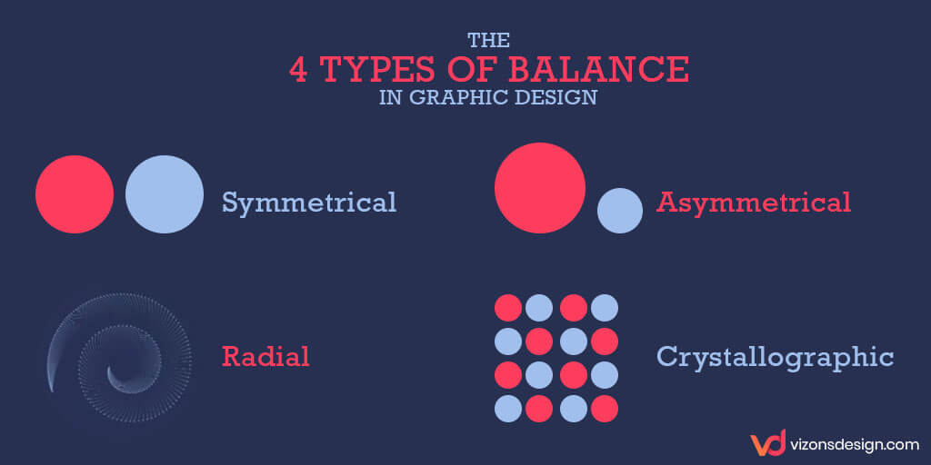
Even though the image’s elements don’t have physical mass, balance assigns these elements with a visual weight. And this is how some elements can appear heavier while others appear lighter. Have you ever looked at an image and thought something wasn’t quite right about it? Like a person standing on one foot, it was most likely that poor consideration of balance was a factor. Conversely, an aesthetically-pleasing image will use one of four types of balance; radial, symmetrical, crystallographic, or asymmetrical. At least one of these types of balance in graphic design is necessary to create professional results.
Sometimes, established artists applies balance instinctively. However, a little education in balance for all of us is not a bad thing. After all, balance make our designs, illustrations, and photos ideally perfect. Read on to uncover how to apply the four types of balance in graphic design for captivating images.
[divider]
What is Balance in Graphic Design?
Balance is the proper distribution of elements in a design. Our eyes constantly seek order and stability in images. And this is why we’re generally attracted to symmetrical objects and faces. By assigning image elements with visual weight, we can encourage a sense of balance and stability. Not only does this make the image more appealing, but also relax the eye.
Now, let’s discuss the four types of balance that can be used in graphic design, photography, and artwork.
1. Symmetrical Balance
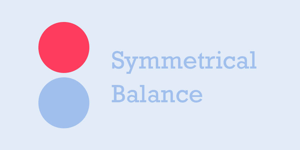
What Is Symmetrical Balance?
Symmetrical balance obtained by giving equal size to elements across the center point of a composition. And the center point is not necessarily directly center in the design. It can be diagonal, vertical, or horizontal. The result is a mirrored image that appears to have an exact equal balance.
How To Use Symmetrical Balance?
One of the most effective uses of symmetry is that it can make flawed or messy images tidy. This type of balance is ideal for website designs because they are wide layouts. Website designers can repeat an image across an awkward area to enhance the layout. In symmetrical images, the eye is drawn towards the center of the image. Using symmetrical images you can ideally place a call-to-action or heading within it.
Symmetry is inborn. We instinctively find symmetrical things to be more attractive. This could be because we like order in an unstructured world. Or, it could be due to evolutionary theory pointing us towards a healthy mate. Regardless, it’s obvious that almost everybody finds symmetrical images more appealing.
2. Asymmetrical Balance
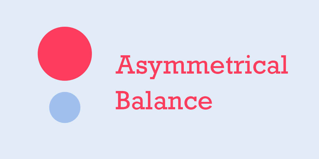
What is Asymmetrical Balance?
Asymmetrical balance is achieved with different layout elements that are equally weighted. It can be two elements with similar weight but different sizes or shapes. Or, a heavier element balanced by a couple of lesser focal points. Compared to symmetry, asymmetrical elements make for more interesting images. They can also result in images with varying levels of attractiveness.
How Do I Use Asymmetrical Balance?
In contrast to symmetry, asymmetrical balance is more difficult to achieve and usually requires more skill. But, the result can be images that look and feel engaging, modern, and energetic. Plus, asymmetrical balance can be intriguing and refreshing.
3. Radial Balance
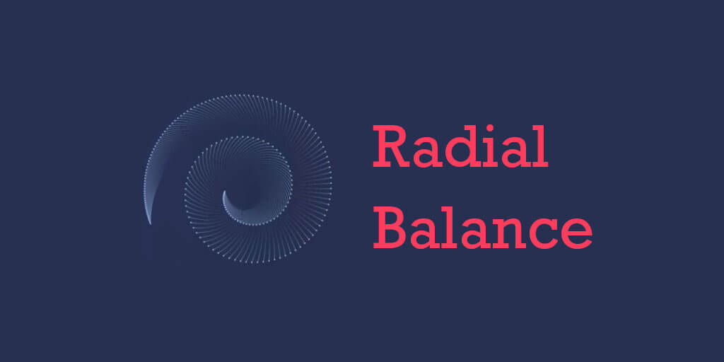
What is Radial Balance?
Radial balance relates to elements that spread out from a central point. For example, rays of sunlight and water ripples is evenly spread, thus creating a radial symmetry. Radial balance elements tend to have a hypnotic, calming quality, and draws the eye towards a central focal point. In artwork, the design is very symmetrical, but the sense of shapes flowing into each other creates a soothing layout.
Using Radial Balance In Graphic Design
Radial balance is a beautiful form of balance. It naturally occurs in flower petals and whirlpools. Spirals are the best way to achieve radial balance in graphic design. Various types of promotional materials such as event posters and sales flyers frequently use the radial balance concept. Using radial balance in these types of materials draw customers’ attention to a date or an offer.
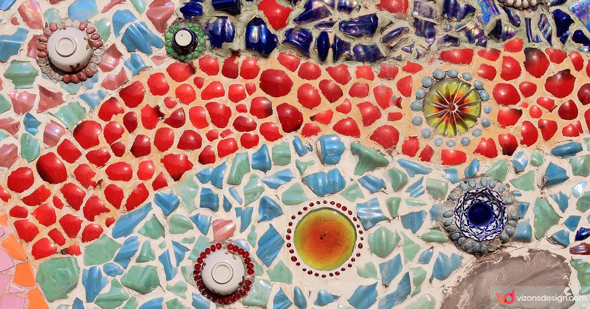
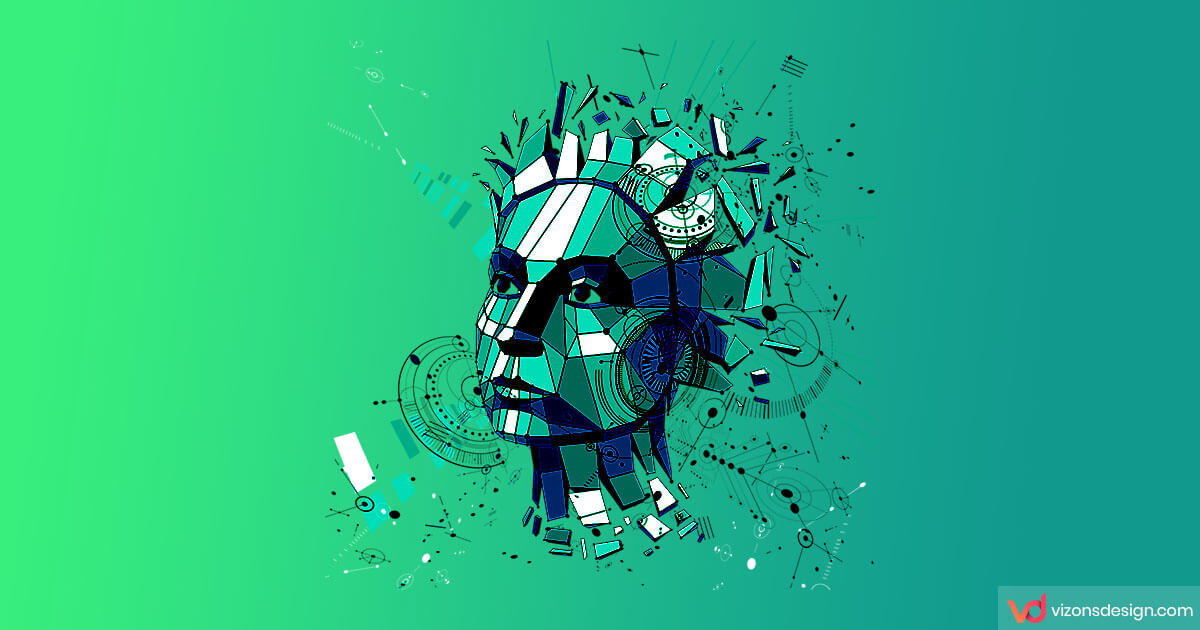
4. Crystallographic Balance
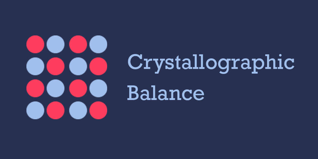
What is Crystallographic Balance?
Crystallographic balance is often referred to as ‘mosaic’. It’s achieved by giving equal weight to a large number of elements. Unlike symmetry, the result is not a perfectly even pattern. Instead, it’s a type of balanced chaos in which several different elements combine to make a whole. Consequently, because there’s no single focal point, the viewer is tricked into accepting the image as a balanced whole. This holds true even if there are a multitude of random elements.
How Do You Use Crystallographic Balance?
Mosaic balance is promoted in designs by cramming the layout with different elements. But if the layouts are too sparse, it will dilute the effect. There are different techniques used to create a crystallographic such using a repeating pattern.
You may also enjoy reading: Graphic Design Styles Predictions For 2021
Bright and Bold Colorful Templates Design
Bright and bold design color trends are changing the way designers use colors in their…
Graphic Design Styles Predictions For 2021
From Pop Art to Surrealism to 3D, let's take a look at graphic design styles…
How Creativity Has Changed During COVID-19
It’s pointless to keep fooling ourselves saying ‘When things get back to normal’. Every American…
3 Inventive Graphic Design Trends For 2022
Graphic design is a highly distinguished industry. Styles, techniques and design trends actually shape the…