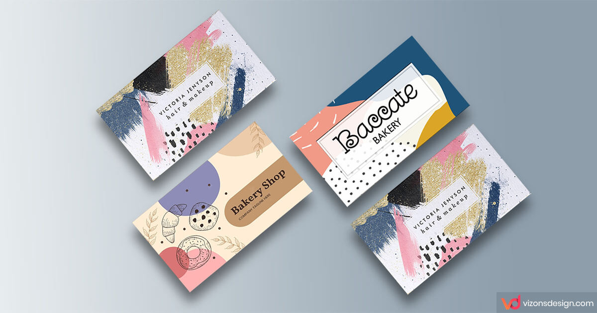
When designing custom unique business cards, your color scheme is an important consideration. In addition to fonts and layout, colors make your custom unique business cards stand out. Not only that, but colors also help communicate who you are and what you do. Moreover, the colors you choose also attracts potential customers, ultimately leading to sales.
Don’t be tempted to just use the brightest and boldest colors. Or use just black and white, or your favorite colors. Generally speaking, these colors are not necessarily wrong, but you may be forgetting about your branding. In fact, different colors and combinations influence how people feel and react to your brand.
So, from color schemes to psychology, we’ll discuss the elements to choosing custom unique business cards.
Brand First
If you run a cosmetic business, do you have to choose pink cards? While color theory is interesting, it’s not the only thing you need to consider. Custom unique business cards colors are the ones that’s consistent with your current brand.
The starting element is your logo colors, then design your business cards to match that. Going a step further, your website design should include your logo colors also. If your branding changes, you should refresh all marketing materials to ensure a cohesiveness across all mediums. This includes business cards, print collateral, and of course, your website.
Consider your company culture and brand personality. If your business is about wildlife, you might opt for more subdued card colors. On the other hand, creative brands can be more playful and daring with bold color choices.
You should also do some research to compare colors of your competitors. If your colors are too similar to competing brands, your odds increase for getting lost in the crowd.
Custom Unique Business Cards Color Psychology
According to psychologists, color can have an extraordinary impact on our mood. Some colors are said to make us feel calm and relaxed, while others energize. Some colors and shades also have cultural associations. For instance, spiritual or wealth, which we may not consciously realize. Consequently, being aware of these common meanings are helpful in making an informed decision for your business.
Purple. The color of power and royalty, purple is seen in premium brands to exude luxury and quality. But purple is equally associated with spirituality, so it’s used by artists, healers, and yoga teachers.
Red. Bold, action-oriented and passionate. It’s often seen in fast food branding. Also deeper reds like burgundies and maroons can be equally dramatic. But with a more serious edge.
Yellow. Both uplifting and intellectual, yellow is said to stimulate the brain. This color could be a good choice for entertainers, educators, or journalists.
Blue. Reliable and calming, blue is one of the most professional business card colors. This color is often used by legal firms or financial who want to encourage trust.
Orange. Associated with peace, health, and nature, making it ideal for wellness or eco brands. But since it’s the color of money, green can also suggest security and wealth.
Black. This color has many associations, from power and formality to mourning. Used with touches of metallics or white, black can be stylish and striking. Think high-end fashion brands.
Pink. Communicates nurturing and care, so pink works for beauty brands and even charities. It’s also often seen as ‘girly’ and young. However, dustier, softer pinks are sophisticated and calming.
The Color Wheel
After you’ve chosen a dominant color for your card, you need to select complementary colors to complete the palette. You can get these colors from the color wheel. You know? The one from art class.
The color wheel consists of 3 primary colors – red, yellow, blue. Three secondary colors – green, orange and purple. And 6 tertiary colors. The territory colors are made from primary and secondary colors resulting in blue-green or red-violet.
The position of colors on the wheel helps us find shades that work well together and create different effects. And complementary colors are on the opposite side of the wheel. For example, red and green, or orange and blue. The sharp contrast between these colors can pop.
Finally, make sure the colors you choose highlight rather than hide your all-important contact details. Even the most stylish business cards are worthless if they don’t do the job!
You may also enjoy reading: Creative Ways To Use Personalized Address Labels